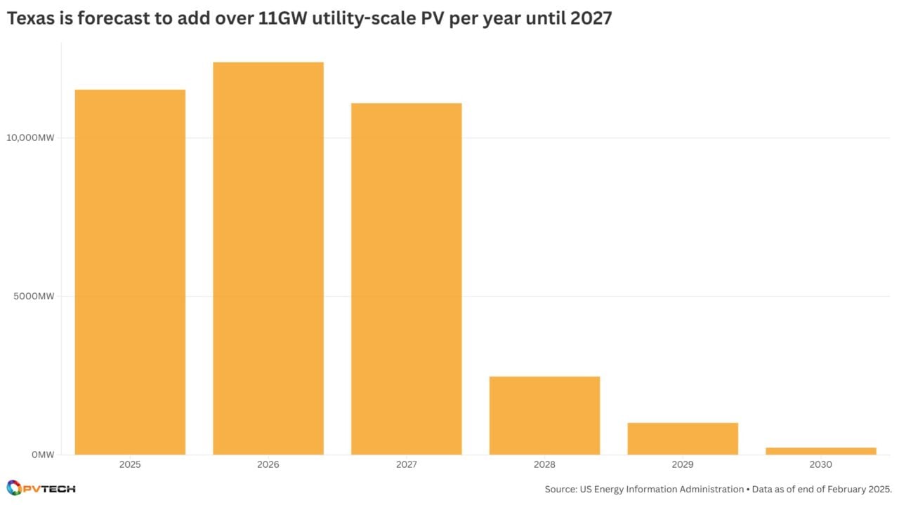
The chart examines how the state’s upcoming utility-scale solar pipeline fares with other states, when and how much capacity will be added in the coming years, and which regions will add the most capacity.
In addition to the exclusive chart of the month, the newsletter also showcases charts from some of our recent articles, covering financial results, capacity additions, auctions and tenders and a variety of other topics that vary from month to month.
The inaugural edition covered capacity additions in the US—which added 50GW of PV capacity in 2024— and worldwide. In addition, we look at the financial results of solar manufacturers Canadian Solar, JinkoSolar—with charts showcasing the companies module shipments on a quarterly basis—and US residential installer Sunnova, how the origin of solar cells has impacted the price of modules in the US (Premium access), France’s latest rooftop solar results, and finally, US president Donald Trump’s rapidly-paused tariffs get a chart showing how some countries with a solar manufacturing footprint have been impacted.
Subscribe to ‘The PV Data Dispatch’ today.